Creative Design of English Alphabet Graphics III
Figure 3(A) uses the horizontal alignment method. Put the logo designed in English letters in a more conspicuous place. Usually, according to the law of visual viewing, place the logo on the left. In order to highlight the characteristics of the logo, enlarge it. At this point, it will be found that due to the unique shape of the logo, the arrangement of the rest of the business card space is more difficult to handle. Therefore, a light gray substrate is used as the fill of the rest of the space and the logo is better represented. At the same time, the gray scale does not use traditional straight-line segmentation, but divides the baseline with the right-side edge of the letter “Y†in the logo. This creates a similar arrow in the light gray space. The shape is consistent with the arrow in the logo, achieving a better combination, and the arrangement of the name continues the method of arrangement on the right, placed on the light gray floor. (A) The design scheme adopted is a traditional fashion treatment method. It can be said that the use of gray tone is one of the most difficult to grasp colors in the design. When it is not good, it will feel depressed, but if you use it well, it is The most modern colors. Here, the gray tone plays a good role in its modern and stylish atmosphere. With the uniqueness of the logo, it brings a new dynamic to the entire business card picture. Figure 3(B) uses a non-traditional vertical arrangement method. . The logo was placed in an eye-catching position, and a light gray substrate was also used. What was different was that the black and white Chinese character banners were arranged in a vertical arrangement of Chinese characters, which caused a certain change in the shape of the logo. This subtle change is permissible. The gray bottom is also divided by the right-side line of the letter “Yâ€, but it forms a step-like color block, which means that the company’s operations are even more floor-level. , Hanning banner suppressed the white bottom and gray substrate, as a breakthrough between the two color blocks, and the name is ranked below, and with the banner at the end of the head. The entire (B) set of design is a combination of Chinese and Western design methods. Its shape is concise and unique. There is a upward trend that is a slender and characteristic design. After many disputes and comparisons, it was decided that the business card (A) design plan was the company's business card style.
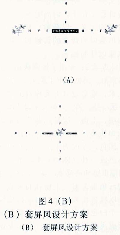
2) Hall screen design
The hall screen design belongs to the design of the store design in CI design. From a certain point of view, it also belongs to a simple interior design. The hall screen plays a role in guiding and giving the customer a first impression. After determining the logos and business card styles, according to the characteristics of the logos, the logos formed by the English alphabets were designed in conjunction with other English alphabets to design four sets of programs, as shown in Figure 4 (A), (B), (C), (D ) as shown.
(to be continued)
Silicone Toilet Brush,Floor Brush,Window Cleaning Brush,Dusting Brush
Ningbo Topwill International Trade Co., Ltd. , https://www.nbtopwell.com