The packaging design story behind IKEA
[Chinese Packaging Network News] When visiting IKEA, in addition to buying various kinds of furniture, and eating delicious foods, there is an absolutely indispensable link, that is, after finishing the account, go to the IKEA's Swedish food house to stroll around. With the most authentic Swedish flavours, besides chocolate, candy and other snacks, there are many of the most authentic Swedish ingredients available, so that you can also make classic dishes in the IKEA restaurant.
However, have you noticed that the full Swedish letter does not seem to affect your choice of food, you can still easily find your own goals, the reason is naturally clear and distinct food packaging, and these simple and practical The aesthetic design is based on an old friend of IKEA, the Stockholm Design Lab (SDL).
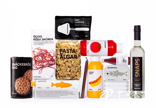
SDL has been designing product packaging for IKEA for nearly 20 years. This time, the redesign of food packaging and the promotion of Swedish cuisine on a global scale was naturally handed over to SDL. In addition, IKEA has also set up two problems for SDL. One is to use the special font Verdana of IKEA, and the other is to keep the Swedish food name on the package. When language is limited, visual nature becomes the best expression.

So the simplest and most effective way to present food is to use the food itself. As a result, SDL abandoned all unnecessary information and decorative elements, resulting in the most IKEA food packaging.
In the design of food packaging, they uphold three principles: the packaging of condiments, sweets, and fruits should be as transparent as possible in order to display the food itself; canned foods should be illustrated with iconic illustrations or silhouettes; When you need more information, use physical photos directly.

Buyers can only rely on the packaging of the product to understand what they can buy and what they eat. SDL's packaging allows the design to return to its original position, balancing the delicate relationship between the product and the packaging. It is rare.

Taking canned salmon as an example, SDL printed the squid directly on the surface of the can, and cleverly fused the pull ring with the head of the squid, just to understand the contents of the can. The bolognese is made into a practical tubular package, with a pure white background. It is simply and vividly printed with bright, monochrome silhouettes illustrating the taste of the meat sauce.

The idea of ​​beverage packaging is also the same. Fruit patterns are directly printed to illustrate taste, while black and white backgrounds indicate whether there is alcohol or not.

In the past 20 years of cooperation between SDL and IKEA, more often than not, the packaging of products for IKEA has been designed. The packaging is based on IKEA's economical and effective flat packaging. But the package designed by SDL for IKEA was even cheaper and more practical than before. And food packaging design ideas are very similar, SDL chose to display the hollow design of the product intuitively, but also to ensure practicality, the product is installed in the box is firmly fixed, do not have to worry about what will be released inside, at the same time There are also two holes in the box for consumers to take care of, and take into account the actual needs of buyers.

Next time you visit IKEA, don't forget to feel the packaging of the product you are holding in your hand, or go to the Swedish food house to see more, in addition to buying the most Swedish flavor, but also to buy such elegant Swedish packaging design, from the side feel how IKEA from these details to create a 360-degree IKEA wind without dead ends.


Nantong Zhuoluo International Trading Co., Ltd , https://www.zlhomedecor.com